A case study · Teacher Agenda
Four boards, three years, one shift: from a frame students watched to a lesson they help improve.
Teacher Agenda began as a Figma file that I projected on my Promethean board every morning and shared by link, so students could open it on the lab iMacs or their Chromebooks. Students could look, but they could not act, and I could not see what happened. The live app gave them a way in, gave me evidence, and turned their feedback into the next draft of the lesson.
- 4 versions
- 3 years
- about 130 students use it today
The brief
One screen, four jobs.
I teach Film & TV Production and Graphic Design at Salpointe Catholic High School in Tucson. I needed one place to handle all of this, and nothing I used did. So I treated the problem as a design challenge.
01
Show the day
Display the agenda and the learning objective where every student can see them.
In useBoards are scheduled across the whole term.
02
Scaffold and differentiate
Break each lesson into steps a student can follow alone, and let students split any step into smaller ones.
In useStudents check steps off in class.
03
Check retention
Check retention before the next day’s lesson with short questions drawn from earlier teaching.
Built, not yet usedBuilt. Students haven’t used it yet.
04
Share the calendar
Share due dates, events, and the school calendar with students, administrators, and parents.
In useLive for students. Administrator and parent links are built.
The test I use
My students no longer ask, “What are we doing today?”
01 · Fall 2023
Introduction Board
A prayer, a plan, and the minutes beside each step.
It began as a single frame: the first screen every student saw at the door. A prayer opened the day. An agenda listed each step with its minutes beside it, followed by a few reminders and one sentence naming what students would be able to do by the end of the period. I drew it in Figma, in the school’s colours, with a tab along the bottom for each class. I projected it on my Promethean board and shared the Figma link, so students could open the same board on the lab iMacs or their Chromebooks.
It worked, and that created the problem. Every day demanded a new frame.
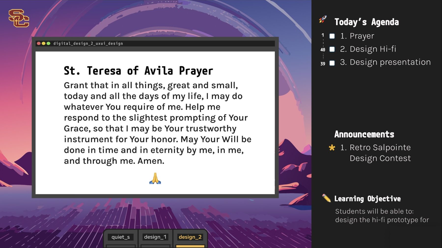
- 1The plan, as a checklistThree steps in order, each with a box to tick on the Promethean board. Every later version kept this.
- 2Minutes beside every stepA small number marks how long each step runs. This detail survived every rebuild.
- 3The openingA prayer fills a window of its own. The window imitates a file in a code editor, titled after the course: digital_design_2_uxui_design.
- 4AnnouncementsOne line carries whatever the school needed students to know today. This one announced a retro Salpointe design contest.
- 5Learning objectiveOne sentence names the skill students will demonstrate, written in the “Students will be able to” form.
- 6One tab per classquiet_s, design_1, design_2. Switching classes meant switching frames.
What it got right
- It settled the anatomy: a plan, minutes, an aim, and room for announcements. Every later version keeps all four.
- It fixed the opening in place. The prayer always appeared first.
Where it strained
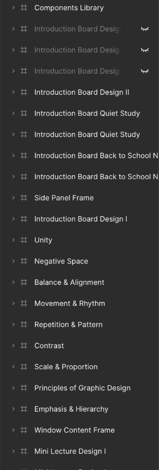
- One frame per lesson. A single unit on the principles of graphic design consumed nine frames: Unity, Negative Space, Balance & Alignment, Movement & Rhythm, Repetition & Pattern, Contrast, Scale & Proportion, Principles of Graphic Design, and Emphasis & Hierarchy.
- Students could open the board through the Figma link, but they could only look. Nothing they did saved.
02 · Fall 2024
Nintendo Introduction Board 2.0
What if the board played like a game?
Version two kept the same parts and wrapped them in a game. The agenda became a Flight Path, and each step earned a status light: yellow while it waits, green when it is the step in progress, with its minutes in a pill below the light. The objective became a Skill Power-Up. An NES controller framed the whole screen.
It also served more than one class. Colour-coded course tabs ran along the top with a strip of weekdays beneath, so one board could cover culinary arts, animation, and design.
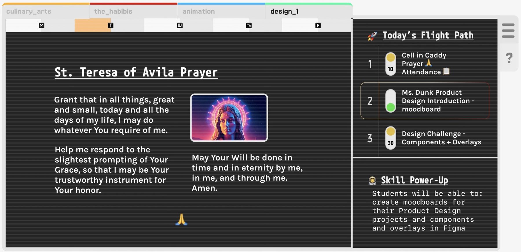
- 1A tab per courseculinary_arts, the_habibis, animation, design_1, each with its own colour stripe. One board covered several classes.
- 2A weekday stripM T W Th F, with today lit. The first board used a frame per lesson; this one began to behave like a calendar.
- 3The same prayerSt. Teresa of Avila’s prayer appears word for word as on the first board, wearing a new skin. The opening survived a complete redesign.
- 4Status lightsYellow waits, green means now, and the minutes sit in a pill below the light. One glance answers “Where are we?”
- 5Skill Power-UpThe learning objective, renamed for the game. That day’s goal: create moodboards, and work with components and overlays in Figma.
What it got right
- Status lights let anyone read “Where are we?” from the back of the room.
- Colour-coded tabs let one board serve several courses.
Where it strained
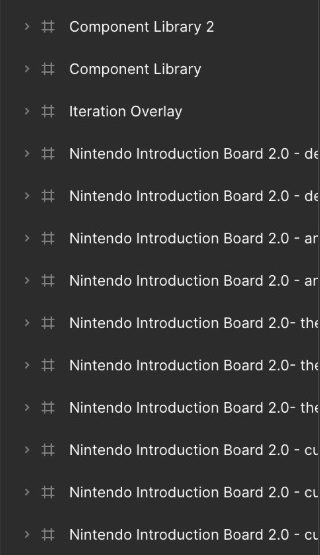
- Ten frames named for course and day, plus two component libraries and an iteration overlay, just to keep them consistent.
- A loud skin demands constant upkeep by hand.
03 · Fall 2025
Glass Board
Dense, calm, and finally built from parts.
Version three dropped the game and kept the grammar. Numbered cards listed the agenda, each with a minute badge and, for the step in progress, a green toggle. A narrow column on the right held What’s Next and the Mission Objective. A dock along the bottom, like a Mac’s, gave each tool and course a launcher one tap away.
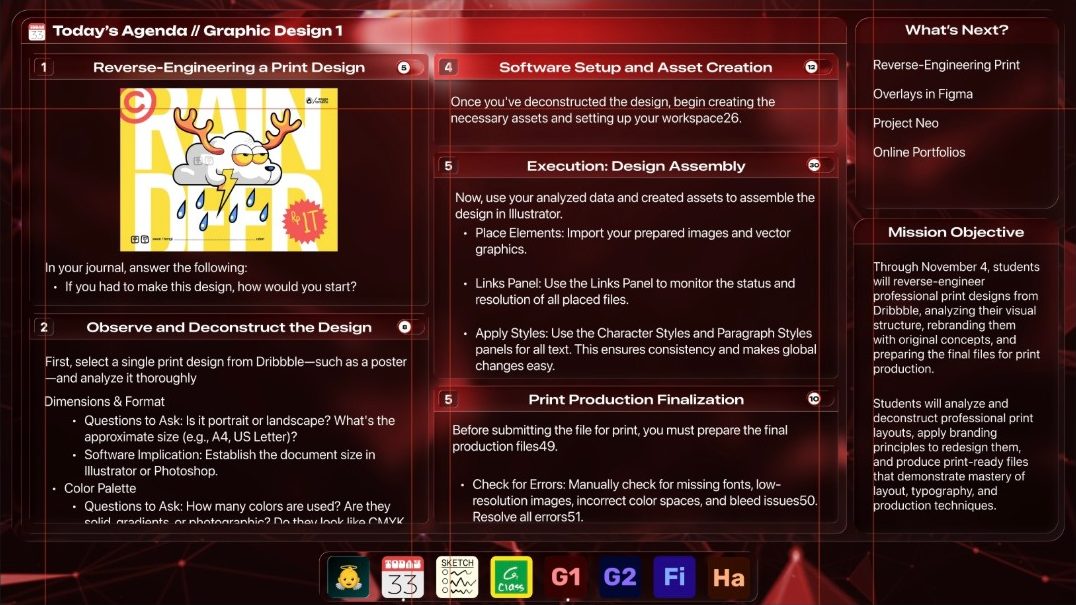
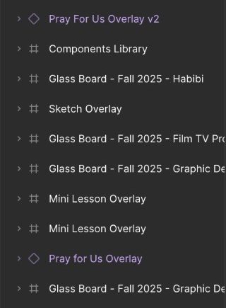
The prayer, the sketch pad, and the mini-lesson became overlays: components that slide over any board when a lesson needs them. Each course wore its own skin, red glass for Graphic Design and blue for Film & TV, and one component library supplied them all.
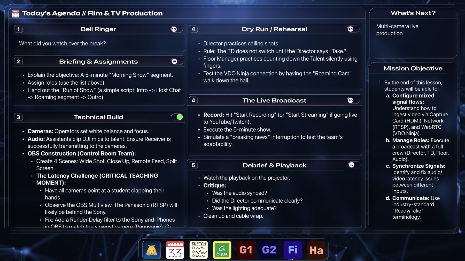
- 1Numbered cards, minute badgesThe agenda stacks as cards: step number on the left, minutes on the right. The 2023 idea, with room to breathe.
- 2A status toggleA green switch marks the step in progress. The status light, matured.
- 3What’s Next?This panel previews what is coming. The first board called it Reminders.
- 4Mission ObjectiveThe aim, now on its third name: Learning Objective, then Skill Power-Up, now Mission Objective.
- 5A dockOne-tap launchers line the bottom, one per tool and course.
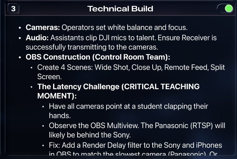
- !Where the frame ran outWhere it brokeCard 3 packs the day’s whole run of show into a fixed-size card, so the text scrolls inside it and cuts off mid-sentence. Nothing on screen signals the hidden lines. A frame has a fixed size. A lesson does not.
What it got right
- Real structure: I assembled cards, badges, and overlays from components instead of redrawing them.
- Real content: this board carries a full multi-camera broadcast lesson, down to the troubleshooting steps.
Where it strained
- It still pictured a lesson instead of holding one. Each section scrolled inside a fixed size, and nothing on screen said so. Students missed the hidden lines and asked me to scroll for them, and I could not easily expand a section.
- It could not remember. A Figma prototype cannot save data across days, so every visit started from zero.
- Students could view it by link on a lab iMac or a Chromebook, but they could not record a step, a rating, or a request for help.
Inside the three files
Count the layers.
The shape of the work changes across the three files. The first holds nearly all boards. By the third, most of the file holds parts that any board can borrow.
The through-line
What never changed.
Six things appear in every version under a different name each time. The fourth version didn’t redesign them. It made each one a field.
The plan
Introduction BoardToday’s Agenda
Nintendo 2.0Today’s Flight Path
Glass BoardToday’s Agenda // Course
Teacher AgendaBlocks in order, bell ringer to independent work
The minutes
Introduction BoardA number beside each step
Nintendo 2.0A pill on each status light
Glass BoardA badge on each card
Teacher AgendaMinutes on every block
The aim
Introduction BoardLearning Objective
Nintendo 2.0Skill Power-Up
Glass BoardMission Objective
Teacher AgendaLesson Objective
Looking ahead
Introduction BoardReminders
Nintendo 2.0—
Glass BoardWhat’s Next?
Teacher AgendaThe year laid out on the school’s calendar
Which class
Introduction BoardTabs along the bottom
Nintendo 2.0Colour-coded tabs and a weekday strip
Glass BoardOne skin per course
Teacher AgendaCourses and sections, with a roster
What students can do
Introduction BoardView it by Figma link
Nintendo 2.0View it by Figma link
Glass BoardView it by Figma link
Teacher AgendaOpen it, check steps off, and rate each one
04 · Dec 2025 → now
Teacher Agenda
The board became data. The data gave students a voice.
In December 2025 I stopped drawing the board and started writing it as a set of blocks: an objective, a bell ringer, a mini-lecture, a discussion, an activity, and independent work. A Figma prototype could not save data across days, and blocks could. Once the board became data, it stopped depending on a file.
Data changed three things at once. Students gained access: a board they could act on instead of watch. I gained evidence: every tick, rating, and answer became a record I could read. The lesson gained a pedagogy: published research stopped being ideas I admired and became features I could ship.
What you project, all period
The same lesson, in a student’s hands
- Write down three scenes where the background is deliberately out of focus.
- Watch the two-minute Depth of Focus clip.
- List the three settings that control depth of field.
- Record your walk-and-talk at f/2.0.Got itShakyLost
- Record the same shot again at f/11.
- Write which version tells the story better, and why.
Ticking keeps your place and has nothing to do with a grade. The three buttons are how it went, for you.
30
board themes
6
built-in teaching frameworks
3
voices written from one lesson: board, checklist, observer’s copy
The lesson shown is invented, as on the home page. No real class or student appears here.
01 · Access
Students stopped watching and started acting.
The frame gave students a view. The app gave them a place to work, a way to say where they were stuck, and a record of their own progress.
A checklist that remembers
In useEvery step a student checks off saves, so Tuesday starts where Monday ended. Ticking is never graded.
A private way to say “Lost”
In useRate any step Got it, Shaky, or Lost with one tap. The rating is never graded.
“Still fuzzy”
In useEvery step a student flagged returns to them as a list they can reopen and clear.
Break it down
Built, not yet usedStudents split any step into smaller pieces of their own, the task analysis I once did by hand for individual students.
Their own look
Built, not yet usedStudents choose how their own screen looks.
02 · Evidence
Every tap became data I could read.
A projected frame leaves no trace. Each feature below leaves a specific record, and the app keeps what students say apart from what they earn.
Completion, per step
In useMarking a step done records participation one step at a time.
Understanding, per step
In useThe gradebook stacks every answer into a bar for each day and each step, and flags any step where half or more of the answers read Shaky or Lost.
Went back and resolved it
In useWhen a student clears a flagged step, the app keeps the original rating. “Was lost, went back, resolved it” shows who noticed their own confusion and acted.
Practice record
In useThe app remembers which thinking routines a class has practised, and how often.
Diagnostic checks
Built, not yet usedTwo or three questions per lesson, each wrong answer revealing one specific misunderstanding. I see the distribution, never a score: “eleven students think the fill light is the main light” becomes a lesson plan.
What the work asked
Built, not yet usedThe app reads every task against Bloom’s revised taxonomy and counts logistics steps apart, so a term that quietly went all-recall shows up.
03 · Pedagogy
Published research became features I could ship.
Each feature implements a named body of work and links to it. Teacher Agenda implements this research. Nobody has studied Teacher Agenda itself.
Thinking routines
In useProject Zero, Harvard
Eight routines in Project Zero’s exact words, ordered so a class repeats what it has already practised, because repetition turns a routine into a habit.
Feedback that closes the loop
In useHattie and Timperley
Where am I going, how am I going, where to next. “Still fuzzy” answers the third question, which my first design ignored.
Six frameworks to choose
Built, not yet usedHarvard, King’s College London, Cambridge, ETH Zürich, UNSW Sydney, CAST
A school or teacher picks Teaching for Understanding, Assessment for Learning, Dialogic Teaching, Productive Failure, Cognitive Load Theory, or UDL. The picker says the frameworks disagree, because they do. Project Zero applies until someone chooses another.
Spaced retrieval
Built, not yet usedResearch on spaced versus massed practice
The bell ringer draws questions from lessons taught one to three weeks earlier, and weights the lessons students found hard.
Collaborative inquiry
Built, not yet usedData Wise, Harvard
A course team sees where students struggled lesson by lesson, weakest first, and records what it tried and whether the problem moved.
The loop
How student feedback improves the lesson.
The pedagogy matters less than the loop around it. Each step gives the next one evidence to use.
01
Say it
A student rates a step, flags it, or splits it into smaller pieces.
In use
02
See it
The gradebook stacks every answer by day and step, and flags the steps worth revisiting.
In use
03
Revise it
Regenerate revises the checklist against the board, keeps my wording where I fixed it, and never wipes a class’s ticks for lines that did not change.
In use
04
Revisit it
Steps students found hard return as bell ringers one to three weeks later.
Built, not yet used
05
Compare it
A course team sees the same numbers by lesson, weakest first, and logs what it tried.
Built, not yet used
06
Return it
Students get their own flags back in “Still fuzzy,” so the people who give feedback see it used.
In use
Then back to 01, with a better lesson.
A design students changed
One rating, three versions in two weeks.
The checklist asks students to rate each step Got it, Shaky, or Lost. I never grade the rating, so saying “Lost” costs nothing. What I built around it changed because of how students used it.
01 · Aug 14
Ask
Three coarse options per step, one tap each. I chose three because a student answers this up to sixteen times a period, and a finer scale buys noisier data at more taps.
02 · Aug 25
Show the teacher
Within two weeks students had logged thousands of completed steps and hundreds of ratings, yet no screen showed any of it to me. The gradebook now stacks a bar for every day and every step, and flags any step where half or more of the answers read Shaky or Lost.
03 · Aug 29
Give it back
The students supplying the data received nothing in return. Hattie and Timperley pose three feedback questions: where am I going, how am I going, and where to next. My design answered only the middle one. So I built “Still fuzzy,” a private list of every step a student has flagged, with a way back into it. Clearing a step preserves its original rating, so “was lost, went back, resolved it” survives instead of flattening into “got it.”
What else a frame could not do
One new frame for every lesson.
Write a lesson once, keep it in a library, and copy it onto any day.
Sections that scrolled out of sight.
Open the checklist on the section in progress, and let students open or fold any section.
Every word typed by hand.
Draft from the lesson’s own objectives and standards, then edit every word.
A skin redrawn for each course.
Choose from thirty board themes, light or dark.
How I built it
Late 2025
I began by having Gemini generate each page while I wrote the boilerplate by hand in VS Code, so I would understand what I was shipping.
Now
I build primarily with Claude, which is much faster.
- Next.js
- Neon
- Vercel
- Better Auth
What I still can’t say.
I can see that a student-facing agenda reduces “what are we doing?” questions. I can’t yet say why some students skip the rating, or whether any of this improves learning rather than convenience.
- Whether students skip the rating because they understood, because they distrust it, or because they find it easy to ignore.
- What the research on self-monitoring and feedback predicts, and whether my designs withstand it.
- Whether the research-based features work once students use them. Retrieval warm-ups, diagnostic checks, the Bloom’s reading, and the course-team view have not met a class yet.
- How to measure learning, not just use.
In spring 2027, other Salpointe teachers start running their classes on Teacher Agenda for the first time.
The build, in dates
Dec 26, 2025
Ran the first successful build on a laptop.
Jan 2, 2026
Deployed to the web with school Google sign-in and an installable app for phones and Chromebooks.
Jul 30, 2026
Added AI drafting for Film & TV and Graphic Design, written as numbered steps.
Aug 3, 2026
Replaced the curriculum with the official Arizona CTE scope and sequences.
Aug 5, 2026
Opened the first student accounts.
Aug 14, 2026
Launched the Got it / Shaky / Lost rating, one tap per step.
Aug 25, 2026
Added a month view, teacher-created events, and student calendar access. Showed how each step landed in the gradebook.
Aug 29, 2026
Launched pricing, licences, and access codes.
Aug 29, 2026
Launched “Still fuzzy”: every step a student flagged, in one private list.
Aug 29, 2026
Built the research layer: thinking routines, diagnostic checks, spaced-retrieval warm-ups, a Bloom’s reading of tasks, and a course-team view.
Aug 30, 2026
Let schools choose the teaching framework behind their drafted lessons.
Sep 9, 2026
Made Regenerate revise the student checklist instead of replacing it.
Sep 13, 2026
Built a lesson library that keeps lessons apart from any class or date.
Sep 26, 2026
Added export, removal, and deletion of student records.
Sep 26, 2026
Launched Break it down: students split a step into pieces of their own.
Sep 27, 2026
Launched independent projects for individuals and groups.
Looking back
What four versions taught me.
01
Keep the minutes in view.
Every version put a number beside every step, in a different costume each time. I never redesigned it, which tells me it carries weight.
02
Build structure from fields, not frames.
Every redraw retyped a lesson into a layout. Once the lesson became blocks, the layout could change without anyone retyping the lesson.
03
Give every student a way to be heard.
The Got it / Shaky / Lost rating is the smallest version of this idea I could build: a private, ungraded way to say “I’m lost” without raising a hand. I also understand it least, which tells me where to look next.
04
Let students act, then return what they say.
Students could always open the board, but only to watch. The checklist lets them check off steps, rate each one, and flag trouble, and “Still fuzzy” returns every flag to its author. People keep giving feedback when it comes back to them.
Bring it to your school.
Teacher Agenda runs at Salpointe today, expands to a select number of Salpointe classrooms in Spring 2027, and opens to other schools in Fall 2027. The waitlist is open now: join it, and we will write when your school can start.
At Salpointe? Open Teacher Agenda.